On the road to Flora
On the road to Flora
On the road to Flora
On the road to Flora
On the road to Flora
CREATING a DESIGN SYSTEM
CREATING a DESIGN SYSTEM
CREATING a DESIGN SYSTEM
CREATING a DESIGN SYSTEM
CREATING a DESIGN SYSTEM
Just when the world started to shut down the borders in early 2020, we plan to hit the road to design system. The foretaste of the previous excursions around libraries year before, made us so excited that we all decided to roll our sleeves, and get ourselves the tickets for this adventure.
Just when the world started to shut down the borders in early 2020, we plan to hit the road to design system. The foretaste of the previous excursions around libraries year before, made us so excited that we all decided to roll our sleeves, and get ourselves the tickets for this adventure.
Just when the world started to shut down the borders in early 2020, we plan to hit the road to design system. The foretaste of the previous excursions around libraries year before, made us so excited that we all decided to roll our sleeves, and get ourselves the tickets for this adventure.
Just when the world started to shut down the borders in early 2020, we plan to hit the road to design system. The foretaste of the previous excursions around libraries year before, made us so excited that we all decided to roll our sleeves, and get ourselves the tickets for this adventure.
Just when the world started to shut down the borders in early 2020, we plan to hit the road to design system. The foretaste of the previous excursions around libraries year before, made us so excited that we all decided to roll our sleeves, and get ourselves the tickets for this adventure.
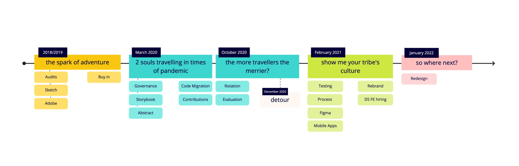
The journey
We've been on a long run to gain design system maturity. Along the way we've been facing challenges, and we had to quickly adapt or experiment. Company focus has been shifting often, team members have been changing. How we learnt to deal with this living organism overtime, was meeting people where they are, and doing our best.
What you can take from our journey are the reasons that brought us to begin, work on the buy in, the knowledge we exchanged, the variety of components we've documented, the culture of adoption & shared ownership we cultivated, the impact we've made & the learnings we take with us.
What you can take from our journey is the reasons that brought us to begin, the arguments for our buy in, the knowledge on the tools we needed to consider & exercise overtime, the variety of components we've documented mainly for our Web product, how we've been shaping the culture of adoption + shared ownership, the impact we've made & the learnings we take with us.
Why do we want to travel now?
Why do we want to travel now?
Identifying the needs and success.
Identifying the needs and success.
The needs were born
During my time in one of the product teams, I quickly identified key pain points and opportunities within the organisation for users and business.
- Build users trust and elevate product quality.
- Minimise the appearance of arbitrary decisions & fatigue, decrease onboarding time.
- Improve & speed the designing and prototyping processes.
- Minimise the technical and design debt.
- Scale product cohesively and get on board new talent quicker.
- Get prepared for global design changes & new visual design direction.
The journey of opportunities
→ Flora will elevate product quality by bringing to our brand and users cohesive and accessible experience.
Flora will elevate product quality by bringing to our brand and users cohesive and accessible experience.
→ Flora will offer productive and empowering ways of working to our teams, leveling up design and code quality.
Flora will offer productive and empowering ways of working to our teams, leveling up design and code quality.
→ Flora will provide a scalable base for company's growth.
Taking into consideration primary needs, I set criteria, which I used as a guide for planning, prioritisation, measuring, and evaluation.
Our car needed fuel.
Our car needed fuel.
Working on the buy in, highlighting opportunities.
Through past 3 years I've been consecutively working on the buy in among leadership, product, and marketing teams. It was not something we did once and then sit calmly, not in our set up. We have been experiencing frequent push backs.
The key when working on the buy in was to highlight the opportunities from various angles. Showing that the end effect will impact our users & brand. Expressing how it ties to Brand and CLTV (company's objectives), having on the radar stability, stickiness and consistency.
Defining what it means to the business: the amount of working hours saved over time = amount of money saved over time. And what it meant to the team, knowing about the decision fatigue, burnouts, and hope to attract talents.
We maybe didn't get all what we wished for, the ideal focus or circumstances for building design system, but what we won overtime was a team advocating for design system and a vision that we don't want our efforts to go in vain.
May I have your passport, please?
May I have your passport, please?
Metrics.
We didn't have enough resources in place for establishing a solid monitoring system and due to the privacy policy some of the tools were not an option for us. Tracking employee's delivery time directly wasn't a part of the company's culture. We heavily relied on manual calculations and qualitative feedback from our users when setting the system.
Measured:
- coverage overtime
- direct-users satisfaction
- adoption
Observed:
- shared ownership
- development speed
- time spend on hand-offs
- effort investment into simple change across the platforms (e.g. color update).
Meeting you where you are.
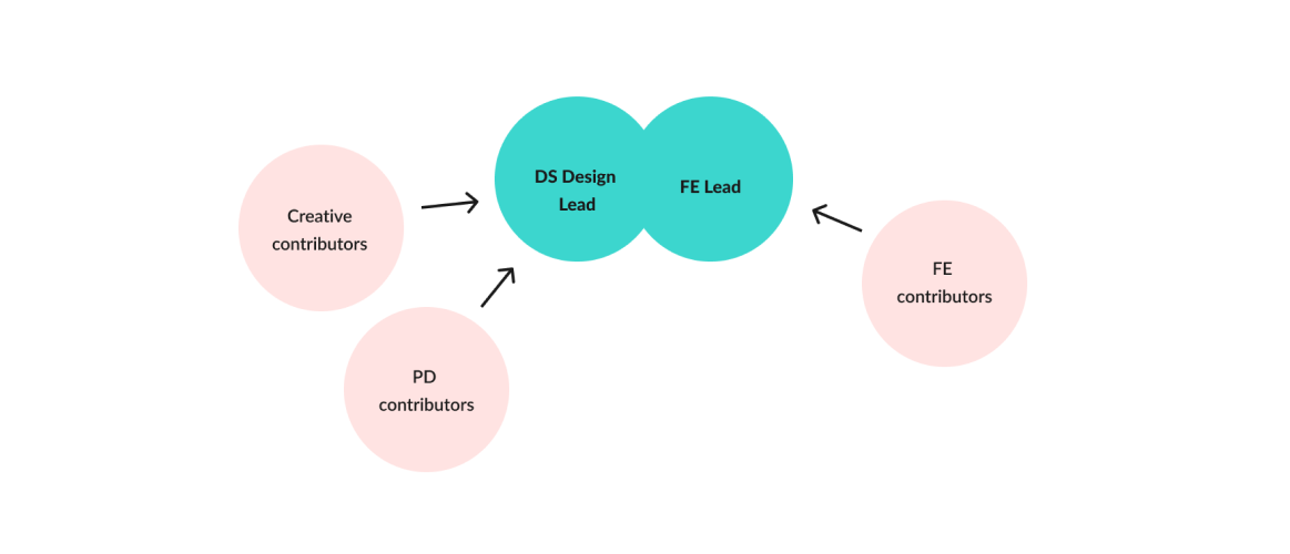
Collaborative ways & Team.
Our set up has been changing overtime. We remained flexible to the company circumstances, and receptive to feedback from the product teams and the individuals. We went from a side project to a team of 2 (designer-engineer duo). Facing challenges we were reformming collaborative ways. Throughout the year I focused on working intensively on shaping a hybrid model, forming a design system culture, to elevate the level of shared ownership.
We kept the collaborative spirit through: shared roadmaps and planning, check-ins, communication channels, collecting feedback on contributor's guidelines, user testing the libraries, feedback loops through surveys, monthly & quarterly retros, open hours and 1-1 sessions, engineering rotations, onboarding & learning sessions, studio days, prioritisations sessions, annual evaluations.
The highlights of the bumpy road.
Flora in action.
Audits & User Insights
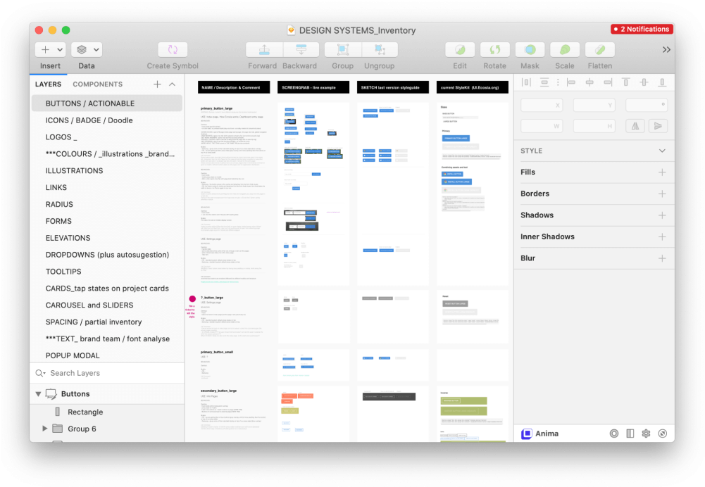
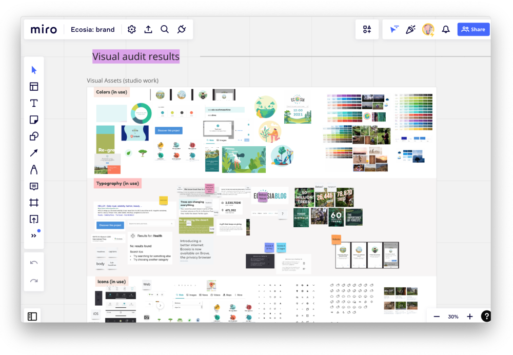
Audits
Before March 2020 I conducted audits on entire product to define the links and to understand what our system will consist of, before diving into work on Sketch Libraries. I've been looking at the product offering in 3 sectors: web, mobile apps, marketing (brand). The audits compared live version vs. Sketch version vs. Ecosia Styleskit of styles and components. I analysed availbility, use, its behaviour, number of variants, and product visibility to the user. Additionally added hints for improvements. During the year of 2020 me and Frontend Engineer made few mini-audits when working together on the guidelines & code, as well as when establishing specific components together with the Search team. Audits have been a helpful practice.
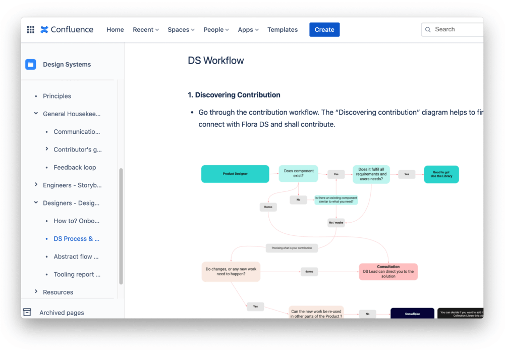
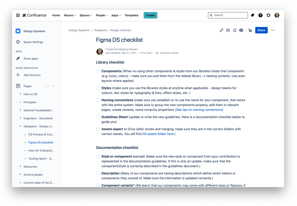
Process & Contribution
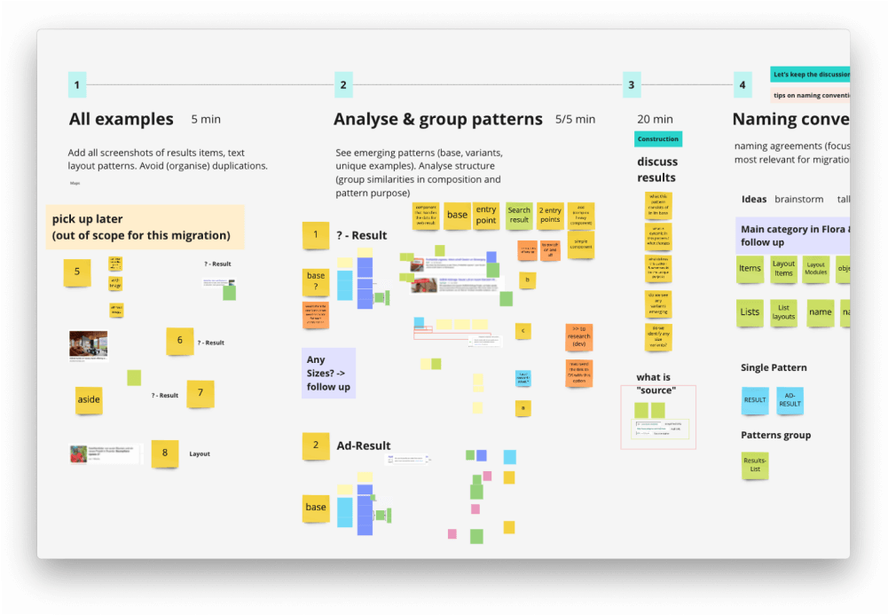
In the first months in the centralised set up I collaborated on establishing a solid theoretical basis (governance) in terms of vision, principles, roadmap, communication channels, feedback loops, versioning, contributor's guide, and ticketing. This has been very important when setting the expectations, keeping others informed, as well as providing directions to the teams who will be contributing. Since we've been fully remote due to pandemic, we (DS duo) used Miro to support each other with mapping the work to be done. We also set up a governance environment in the Confluence, Jira, dedicated Slack channel to offer a visibility to others, as well as ease in tasks management & execution.
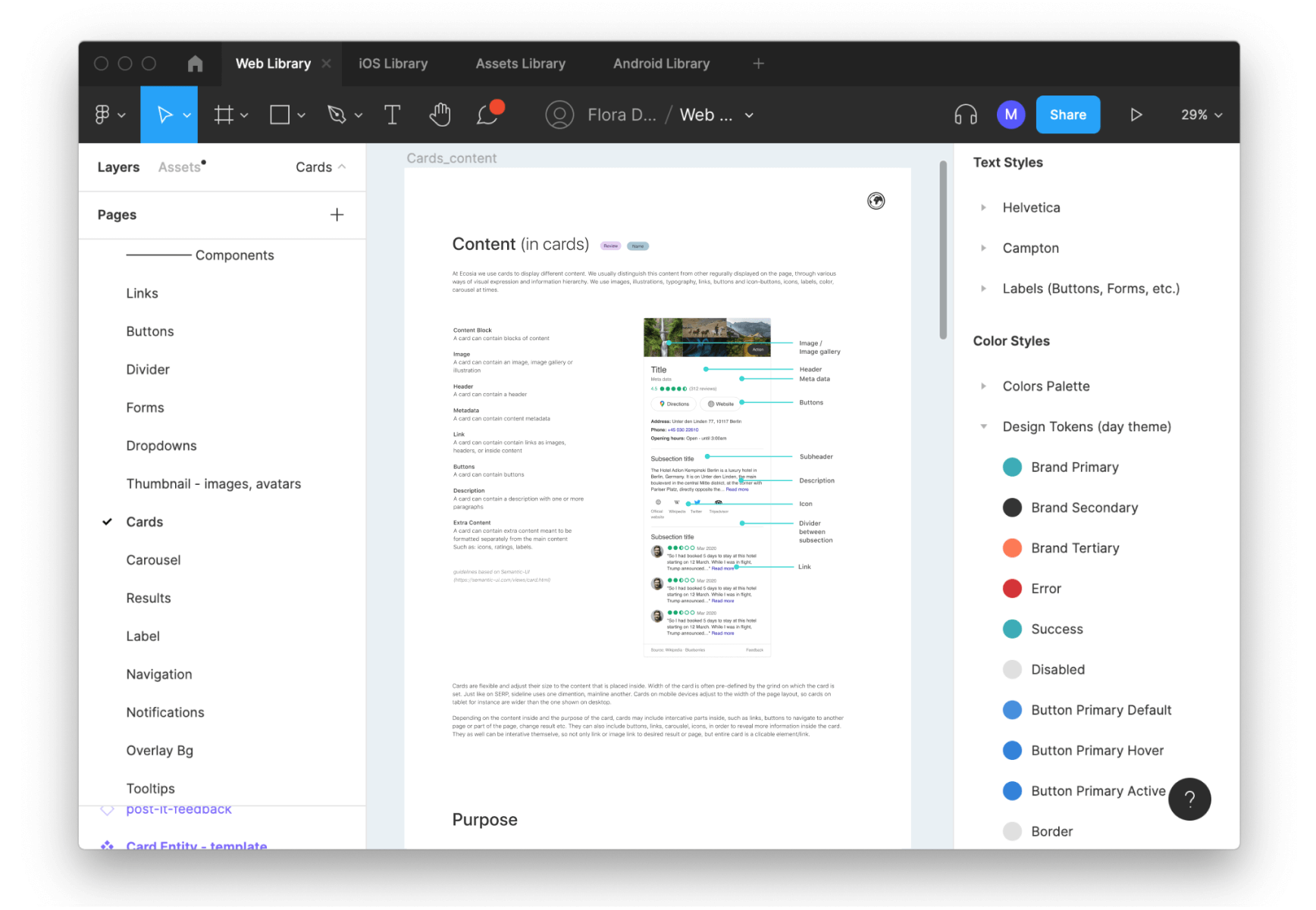
Libraries & Documentation
Parts of our design libraries had been already reflected by me in Sketch before March 2020, however much of the work needed reviews, alignment, and further development between design and engineering.
We defined the structure of the system and shared it between design and engineering teams. We aligned together naming conventions. What really helped us on this journey and moving forward was competitive analysis. Obviously we were not competing directly with other design systems, but that type of research served us as a learning to find solutions to common problems.
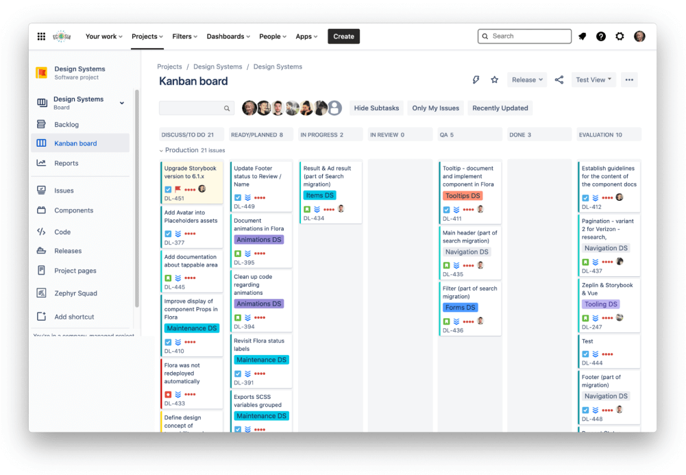
Back in 2019 we had a custom made page that was hosting few components, however the investment costs to evolve it and maintain it were too high for our budget. Following my suggestion, my engineering partner explored and tested the available on the market solution: Storybook. He provided the integration with Vue.js and got the buy in from the rest of the FE guild. Ability to test components in isolation was a big selling point. The excitement on the engineering side started to really pick up.
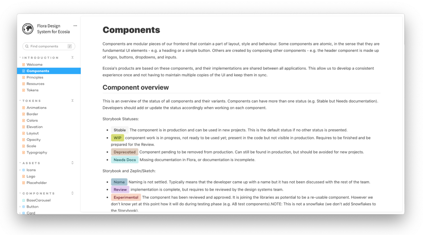
From the start we narrowed our development scope to web only in order to as soon as possible address the critical needs, and provide impact to the biggest audience. We used labels to communicate status of components development, in order to allow a transparent communication with the rest of the product teams.
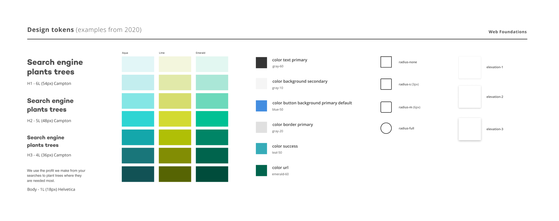
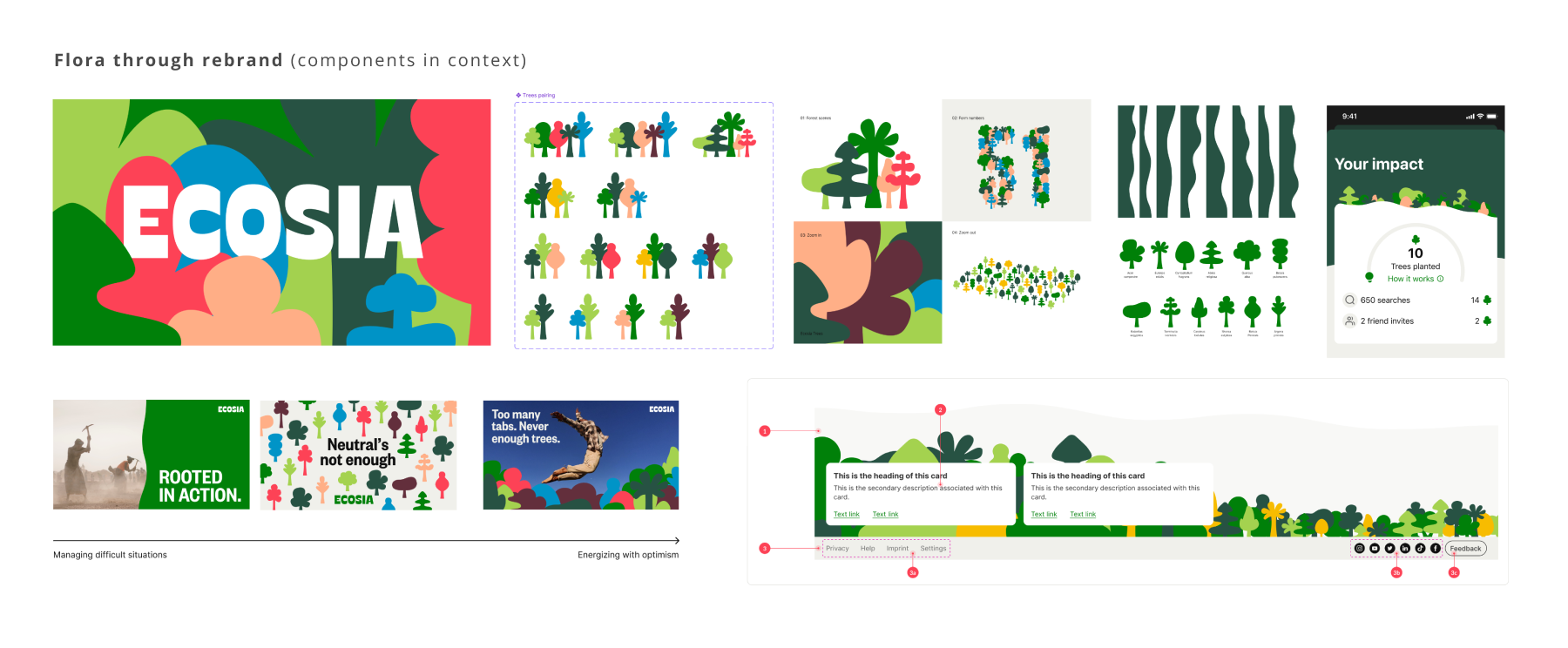
We initiated work on design tokens. The biggest impact brought color semantics that later were used for themes, and rebrand (e.g. color-text-primary, etc).
From the start we narrow our development scope to web only to as soon as possible address the critical needs, as well as impact the highest user visibility. We developed a language of labels to communicate the current status of the components.
We initiated work on design tokens. Among them were color semantics that could serve us later with themes, and global brand updates (e.g. ColorTextPrimary, ColorButtonPrimary, ColorSuccess).
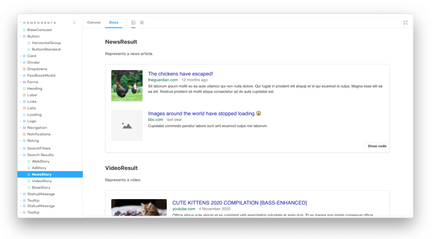
Next we've been able to put the work I've done on the assets into our Storybook and sync them with the code.
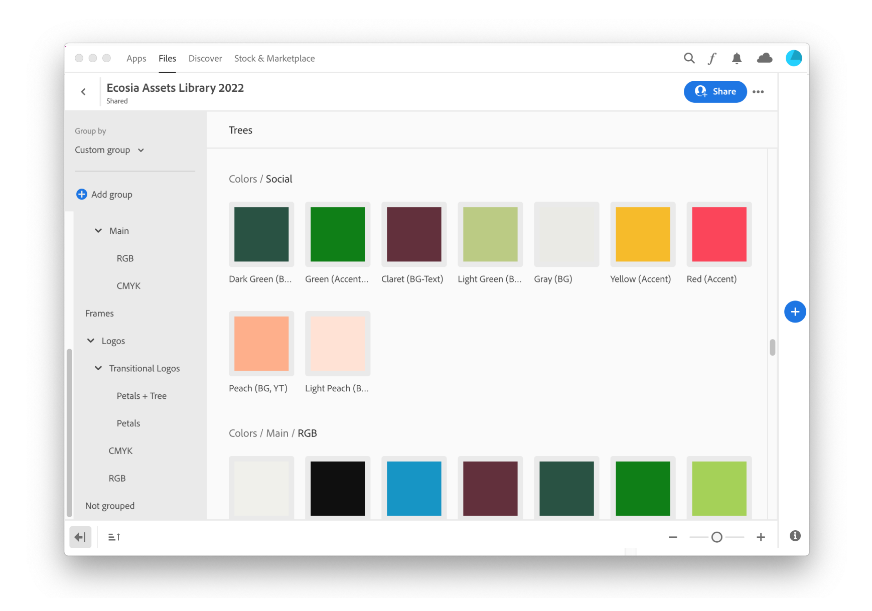
On the marketing side I made sure that the shared foundations such as colors and icons, have been available in the Adobe libraries, so at least in that aspect we could start building bridge and alignement between departmants.
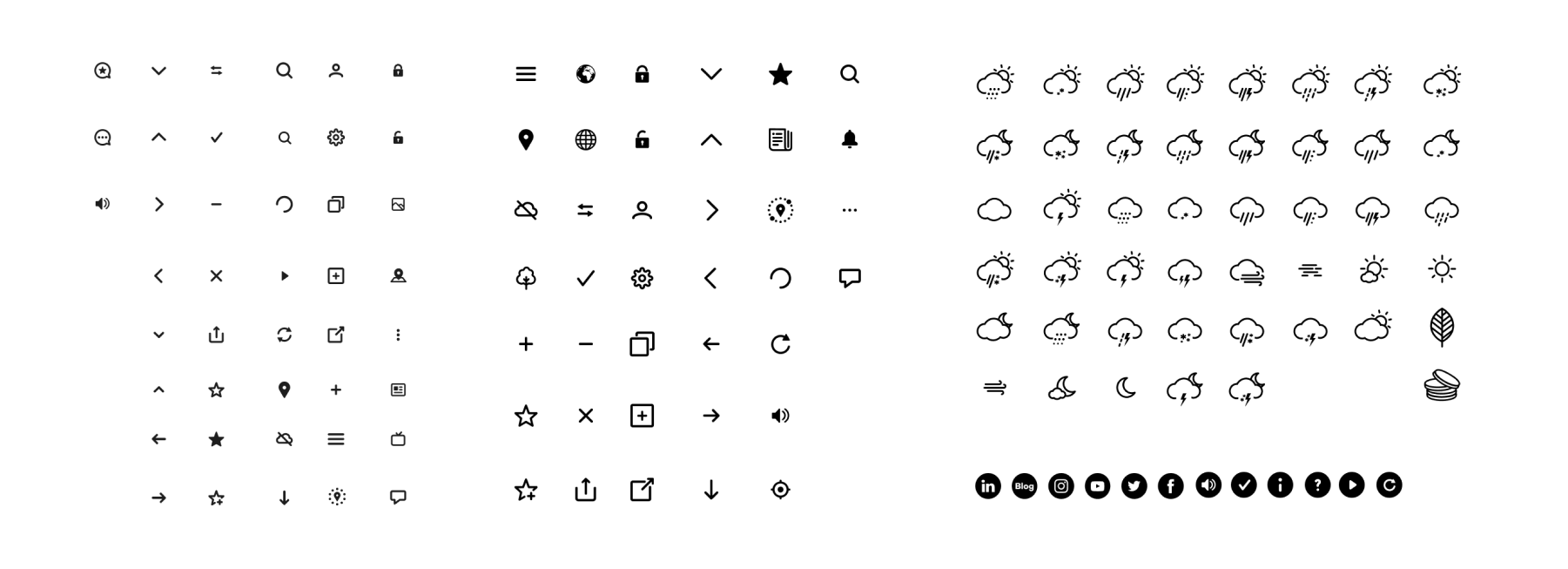
The implementations of our components has been coming through individual contributions from us and the product teams. Search migration initative has been a great add to evolution of Flora.
To coordinate contributions on design side in 2020 I've used Abstract. In the mid of 2021 we hit another milestone → together with the design team I migrated our libraries and design workflow into Figma. We actually never looked back to Sketch since then.
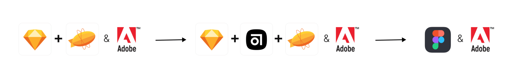
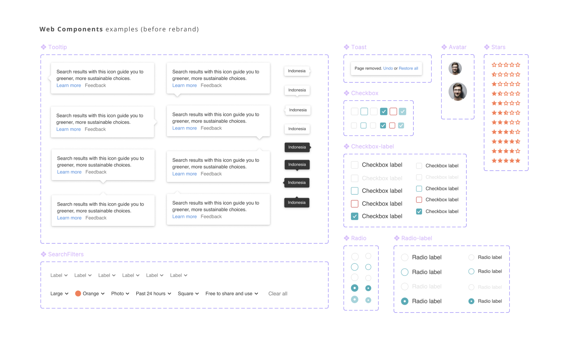
Each of our styles and components would be supported with documented guidelines since the beginning. In the past each page would be exported to Zeplin for easy access & design hands-off. After migration Figma & Storybook were two places holding design and engineering parts. Additionally Adobe would be used by marketing.
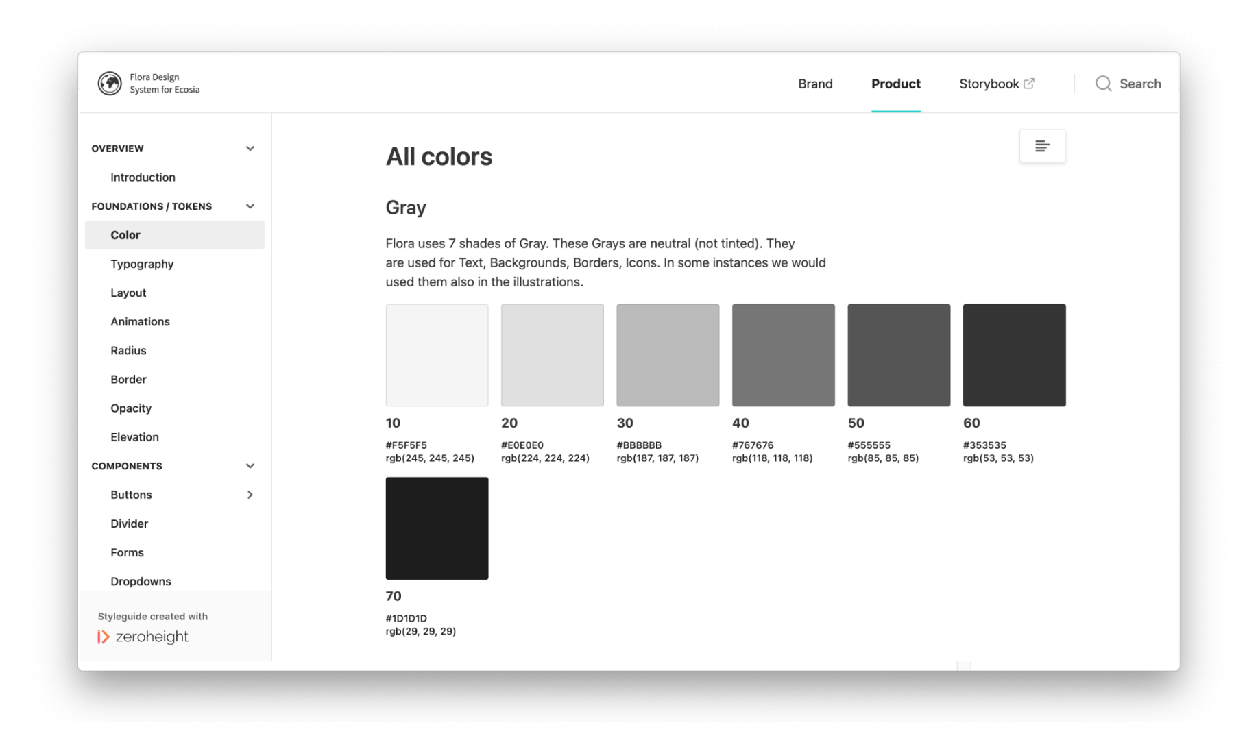
Overtime I also looked into other tools, for instance Zeroheight, to analyse if investing into it could be promising. Due to shortage of resources further testing has been abandoned.
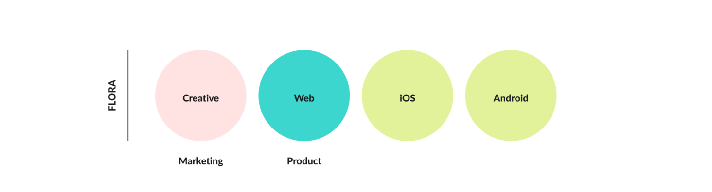
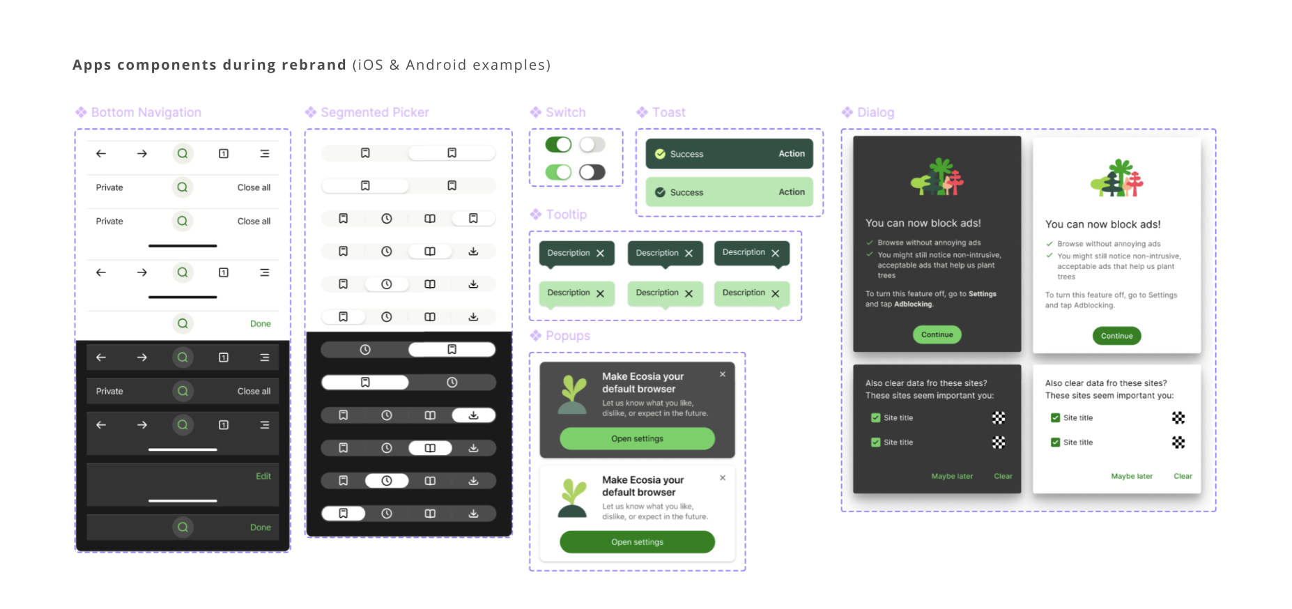
Expanding to Mobile Apps
Next step on this journey during our migration to Figma was building UI kits both for iOS and Android Apps. Since we've been heavily relying on the native systems, we had a mix between Flora foundations and external guidelines. The libraries outcome has been a result of collaborative work between me and a Product Designer (PD - an executor, me - a guide, mentor). Further development of these libraries continued after the rebrand (in 2022).
Jet lag & delayed flights.
Challenges along the way.
Obviously there is no perfect journey, but what makes it interesting are the challenges along the way.
- business pressure - desire to push new features over migration to design system
- the amount of tech & design debt and the scope of the product (marketing, web, apps)
- low engineering availability to implement fixes and iterate (e.g. accessibility global fixes)
- knowledge gaps causing slow process of adoption in the very first year
- lack of leadership on the engineering side (code ownership and management)
- staffing issues and frequent hiring involvement
- major rebrand as well as tools migrations
Souvenirs brought back.
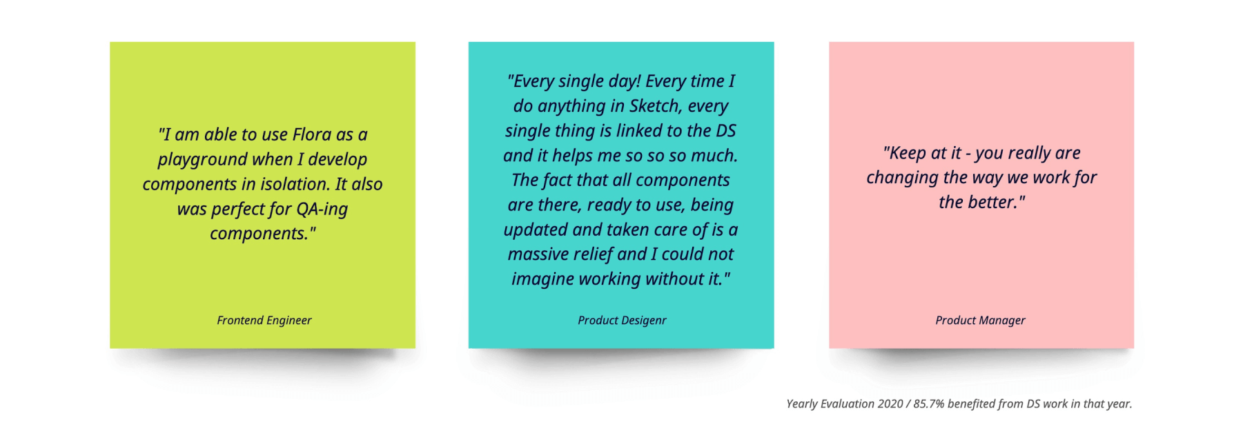
Impact made.
Impact made.
Return on investment:
- delivery speed → designer who uses libraries is proven to be 50% more effective with their time
- cognitive load reduced → for the end-user and for the direct-users (consistency boost)
- code performance → better testing opportunities, cleaner code guidelines
- organisation scalability → sharing guidelines with other engineers, new designers, and external companies minimises the time investment from weeks of work into minutes of work, while expanding the audience reach.
- accessibility score boosted
- brand and UX cohesion
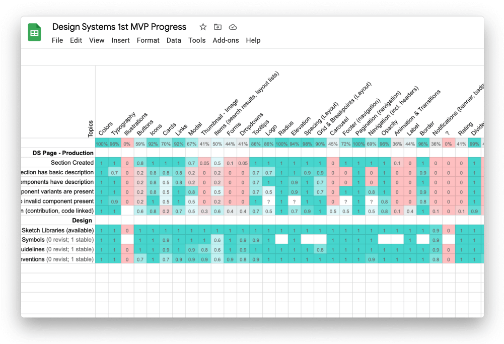
Coverage (data from 2021)
- Design libraries: 90% coverage in Figma for Web & Apps (from what was planned)
- Code libraries: 80 components exist, of which 61 have unit tests, and 17 provide component-specific documentation (Web); the Apps inheriting design tokens structure
- Documentation: 70% of design guidelines documented for Web, 10% for Apps in Figma.
Adoption (data from 2022)
- Product Design: 5 Product teams (web & mobile) = direct contributions
- Engineering: 4 Product teams reusing what has been established
- Marketing design: 4 Creative designers relying on colors foundations, assets, brand guides
Shared ownership
I've been observing a significant improvement from the time when we started in March 2020. At the beginning the team was fearful and resentful when it comes to contributions. The first shift happened during engineering rotation. The next shift was identified in design team during integration of Abstract, and then another right after migration to Figma.
Travel lived stories.
Learnings.
#1 / Setting and maintaining design system is a team sport.
#2 / Accessibility or brand cohesion doesn't sit only within responsibility of the design system.
#3 / The more you talk about the needs and show the value, the more positive response you may receive.
#4 / Meet people where they are, be gentle, responsive, and remain flexible.
#5 / Start small and work on adoption as early as situation allows you.
#6 / Buy in is not enough, a willingness to adjust could be the first step.
#7 / Someone's enthusiasm doesn't mean their direct engagement into the work, someone's enthusiasm doesn't mean lack of fear and doubt.
So where are you heading to?
Aspirations and next steps.
Today ... we continue the journey with a purpose to provide empowering and intuitive experience to our teams and brand. Milestones on my agenda:
- Rebrand (collab with agency 2022)
- DS Engineering Lead hire
- Interactive components in Figma libraries
- Playful and creative activities
- Setting a page to hold the new company guidelines (e.g. back to Zeroheight)
- Bringing tools for localisation of design system
Interested to read more? Discover my journey when redesigning a design system → Re-identifying belonging
Or learnings and processes when leading → Nudging a culture
© 2024 mauthewild.com | All rights reserved.
© 2024 mauthewild.com | All rights reserved.
© 2024 mauthewild.com | All rights reserved.
© 2024 mauthewild.com | All rights reserved.
© 2024 mauthewild.com | All rights reserved.